Citi Plus homepage redesign
Role: UX Researcher & UX designer
Duration: June 2023 to June 2023
Project overview
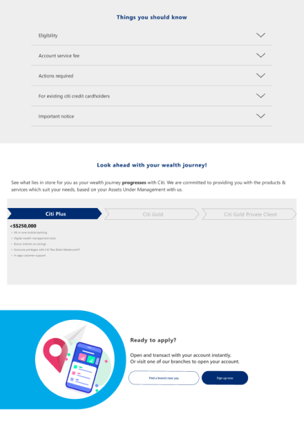
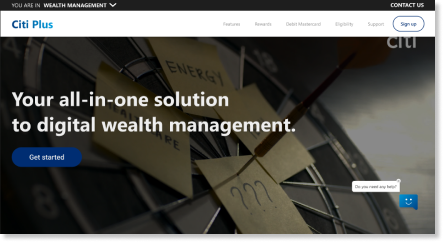
When users search for CitiBank on their search browser, the first search result is Citi Plus. Unfortunately, users don’t realise what Citi Plus is and assume that it is the landing page of CitiBank.
Users who have visited Citi Plus have stated to be confused and do not understand what the page is about.
The Problem
Target users felt confused when navigating the homepage, which made it difficult to explore and understand the website, and trust the bank.
The Goal
Redesign the website to improve user experience for the target user.
Design Process
Uncovering pain points
I conducted user interviews and usability tests with the aim to understand how well the existing homepage met the needs of target users, as well as uncover problems and opportunities for improvements.
Key pain points discovered
None of the users understood
the key contents
of the homepage
CTA button was
hard to see
Content was confusing
and difficult to navigate
Using Personas to visualize the target user
Based on data collected via user research, I could begin to empathize with real users and understand their goals and pain points with the homepage.
The target user were young working adults who were interested to choose a bank that is trustworthy, clear, and supportive in their needs relating to wealth management.
User Flow
I conducted a user flow of what a basic start to finish journey looks like while searching for information. This helps us understand the different ways users can interact with the website, as well as allowing us to see navigation through user goals
User story: As a potential bank user, I want to find the information I need so I can decide if I want to sign up or not.
User Journey Map
By mapping Cheryl’s user journey, it revealed how helpful it would be for users to to have access to a dedicated online platform.
Cheryl (Goal: look for bank information)
Paper wireframes
Multiple changes were taken into consideration based on user pain points.
Digital wireframes
As the initial design phase continued, i made sure to base screen designs on feedback and user research
Original
Wireframe
1. Contents have been rearranged to improve the flow of information and align with the user’s mental model.
Original
Wireframe
2. ‘Sign on’ has been changed to ‘Sign up’ to prevent confusion
Original
Wireframe
3. ‘Apply now’ bar has been removed and changed to a section on the page that does not stick to the screen so that users can focus on exploring instead of being distracted and frustrated.
Mockups
Problem:
Users felt that it did not contain enough information or features to help them
Changes made:
Chatbot has been altered to include frequently asked questions and more topics. This would help users answer questions and better guide them through their navigation experience
Before usability studies
After usability studies
Problem:
Users expressed that they don’t understand the wealth journey.
Changes made:
Title has been rephrased to further emphasize the purpose of the wealth journey and to decrease confusion among users.
Structure of journey to look like a progress instead of pyramid so that users do not confuse the purpose of the wealth journey
After usability studies
Before usability studies
Problem:
Users were slightly confused by arrangement of information
Changes made:
Sections rearranged for better flow and understanding that aligns with the user’s mental model
Key Mockups
Before
After
Accessibility Considerations
Alt-text for images available for users with visual impairment or poor connectivity.
Used icons to help make navigation easier

Takeaways
Additionally, have come to the conclusion that the Citi Debit Mastercard should not have its own section but be under rewards.
This is due to:
User usability studies revealing that users are still confused to the debit card section as it gives them the understanding that Citi Plus is a page for debit cards instead of a wealth management account.
The perks, rewards and the card itself are still rewards and would be viable under the rewards section. More information can be presented under a separate page than the homepage.
I feel that my interviews could have been conducted better by asking better constructed questions. Users have struggled to express themselves or answer questions properly and I struggled to ask the right questions without making it a leading question. There were successful attempts but I feel that the outcome could have been better.
For future purposes, I would like to watch other designer’s interviews so that I can study how they structure their questions.


