eCommerce web-app for a Florist business
Role: UX Researcher & UX designer
Duration: February 2023 to May 2023
Garden of Eden is an online floral shop that aims to streamline online floral purchases for customers. It is is catered to busy working adults with little to no time to order flowers physically by offering them an option to purchase online at their own time and convenience.
Project overview
The problem
Have you ever thought about buying flowers for a special someone but you’re just too busy to travel to physical outlets?
Design process

User research
I conducted interviews and created empathy maps to understand the users I’m designing for and their needs. A primary user group identified was working adults who do not have time to buy flowers at physical shops.
The user group confirmed initial assumptions about Garden of Eden customers, but research also revealed that time was not the only factor limiting users from purchasing flowers. Other user problems include poor customer experience, low stock and lack of payment methods.
Competitive audit
I analyzed several potential competing companies. Garden of Eden has the opportunity to capitalize on this by bringing products from each company to create a one-stop shop without without overwhelming the user's choice.
Uncovering pain points
I conducted user interviews and usability tests with the aim to understand how well the existing homepage met the needs of target users, as well as uncover problems and opportunities for improvements.
Too busy
Payment
methods
Low Stock
Persona
Using insights from both my interviews, I created a persona that reflected my target user base.
Problem statement
Farah is a busy working adult and student who needs a more convenient and in-depth online platform to purchase flowers because she does not have time after work to purchase flowers
User Flow
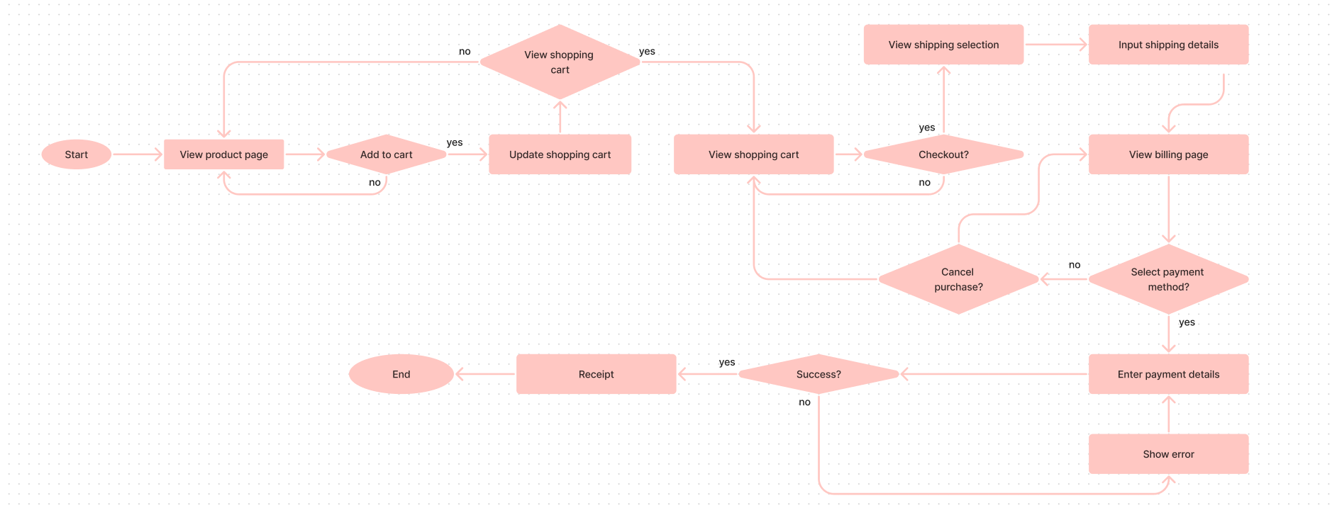
I conducted a user flow of what a basic start to finish journey looks like while purchasing an item. This helps us understand the different ways users can interact with the product, as well as allowing us to see navigation through user goals
User Journey Map
By mapping Farah’s user journey, it revealed how helpful it would be for users to to have access to a dedicated online platform.
Farah (Goal: purchase flowers online safely)
Digital wireframes
As the initial design phase continued, i made sure to base screen designs on feedback and user research
Up-to-date stock on product page.
Easy navigation was a key user need to address in the designs in addition to equipping the app to work with assistive technologies
Multiple payment methods provided as users have expressed concerns about lack of payment methods
I conducted two rounds of usability studies.
Findings from the first study helped guide the designs from wireframes to mockups.
The second study used a high-fidelity prototype and revealed what aspects of the mockup needed refining.
Maze was used to compile the findings.
It was observed that 4 out of 5 think that the message option should have more features.
This means that the message feature is not detailed enoughIt was observed that 4 out of 6 participants have a slight difficulty navigating to purchase history.
This means that it's location is not clear enoughIt was observed that 4 out of 6 participants have slight difficulty with adding their item to cart.
This means that the shopping cart logo is not clear enough
Round 1 findings
A handful number of participants were able to log in successfully.
A handful number of participants were able to add the item to cart successfully.
A handful number of participants found the purchasing experience convenient.
Round 2 findings: Maze
Task 1: Log in
Task 2: Add to cart
Task 3: Complete purchase
Mockups
The ‘order again’ feature was redesigned so that users are able to see more of their options in the homepage. This would make it easier for users to navigate to without using the navigation bar, making it more convenient for returning users.
Before usability studies
After usability studies
Removing items from the cart was redesigned as the original design was not sufficiently clear to users. The X button was changed to ‘remove’ and a prompt was added to clarify with users open their choice.
Before usability studies
After usability studies
Accessibility
Multiple language options for non-english speaking users.
Used icons to help make navigation easier.
Style Guide
Colors
aAbBcC
24, Bold, Montserrat
aAbBcC
16, Regular, Montserrat
aAbBcC
12, Regular, Montserrat
#D61B5F
#FFEDE8
#A34C36
#EBF1EF
#920035
#2F715B
Type
Buttons
Key Takeaways
When reviewing my progress near the end of the journey and after going through several usability studies, i found that the user flow apparently doesn’t match the expectation of the users.
Therefore, I have created another that would represent the user needs more accurately.
This was my first UX project. After going through the whole procedure, I have a deeper sense of appreciation for the research process where we interview participants and analyze their needs through user flows and journey maps.
I feel that I may have took them for granted in this journey. It was only at the end of the process where i realized that using them properly would have further helped me in my journey. In the end, we can only effectively support the user through these stages when we take the time to understand their ideas and feelings.


